Monday 7 May 2012

TVP colouring

After going through the different lining styles, I settled on using the Mechanical Pencil tool drawn with more heavily to keep the definition. With the scene lined, I had to decide a method of colouring.

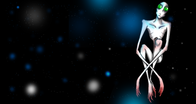
The character at the top of the blog image is sporting the type of colours that I want to have in the final sequence. I can't word it particularly scientifically, but a lot of deep sea fish and animals have a reddish tint because of the absence of red wavelengths at that depth makes them harder to spot, so much like when a deep sea fish is trawled up into lighter waters, the

Rather than making the creature bright red and looking like a bad case of sun burn, I wanted the extremities to be redder than the rest of him which also makes his hands and feet look injured from the climb.

Being against a painted background (Darrien's work) means the colour of the creature isn't a solid white, so I've picked something slightly darker to build on - the colour, for reference, is R:249 G:247 B:247 and the inside of the mouth is R:53 G:17 B:17.


It is still extremely pale contrasted when against the sky, but most of the ending shots feature the sand which should contrast against the lightness.

Getting a textured look for the shading is something I'm quite set on so the character at least seems to fit into the background painting style. With the initial tests the purple shading meant the character didn't have the red colouring, but the red on its own is too much against the bright blue.

I've settled on mixing the two, using two of the default brushes "blood" and "smoke" to get the textured look, colours being the default red for blood and the shading a combination of purple R:99 G:81 B:112 and a darker R:58 G:57 B:71. Eye shading is R:24 G:238 B:57 and R:241 G:255 B:243 for the highlight and R:43 G:124 B:32 with opacity set to 43% for the shadow.
Here's the mixed version, which seems closer to a bruise in colour which I suppose works in a way. I added a texture on top of "blood" set at 2 opacity to keep the pale areas from standing out too much, and also to reduce the bug eyed look. The texture layer was set at 70% opacity.

 And again with the shading opacity reduced-


Saturday 5 May 2012

I've started work on the TVP animation for the end of the film, and I'm testing some different lining styles. The idea behind doing this in TVP rather than Toon Boom is that the Toon Boom animated segment is meant to make the creature appear quite clean and solid (what with the outline blending into the background), while the section outside the hole is meant to be less striking in terms of colours and outlines, appearing more dream-like, for lack of a better description.

The TVP style of lining is meant to be sketchier- not to the extent of having guide lines and the like show up, but definitely rougher than Toon Boom. I want the lines to have more of an energetic feel to them, although I'm still deciding between having the image redrawn every few frames to have the Rhubarb and Custard level of energy or to have it more subdued.

Below are some of the tests I made of s69-


Of these, it's the finer pencil lines that I prefer. The finer lines allow for more detail without appearing rushed. I think it's between drawing 1 (the dark, thin pencil tool) or number 5 (mechanical pencil) although I think number 1 probably works better because of the definition. The character will be stood on a light coloured background, so he still needs to be visible.

Colouring tests will be made shortly.

Thursday 26 April 2012

Progress report 22/4


Following the end of the holiday h0le has undergone some changes in the overall structure of the current animatic after a crisis meeting with Andy about the progress made on the animation.

He went through the old version with me and made some suggestions which helped reduce the overall run time from 4.00 minutes to 3.20, give or take the changes in timing of the completed shots. The entire sequence of the creature being harrassed by the sticky floor of the hole was cut as there were already enough antagonists present against the creature in its relatively short running time and it was over-complicating the film.

I think having a fresh pair of eyes looking at the film really helped. It was easy for me to put as many different things into the film as possible and be unable to see the film working without them- the original version of the animatic became solidified in my mind the more often I rewatched it so my edits consisted of reducing the time of a shot, when it would make more narrative sense to remove it.

This newer version contains some of the work completed over the holidays by Max and Alan. Alan added the effect of the blue lights and we spent some time discussing the best method of creating the intended effect considering the tight number of frames between the creature opening his eyes and the cut to the next part of the shot.The resulting glow has an effect on it that (to me) looks like water reflections so it ties in with one of the original design themes of underwater or deep sea.

Monday 2 April 2012

Lining and Colouring

Use this shot as an example of how the character should look come the final thing-
Closer view-
The lining should be as exact as possible to that character- no feathering.
All lines are in black, excluding that of the blob and blob-like tendrils- they're lined in grey R:51 G:51 b:51.
People working on colouring for hole should use the default bright white and the green value of R: 6 G: 212 B: 78 for the eyes. All lining of the blue symbols should be done in R:0 G:225 B:255.

Friday 2 March 2012

Rough edit v1 17/02


Here is the rough edit from last weeks showing, 17/02/2012.


Current progress based on the most recent version (this weeks) is 20 scenes handed to Lucy, 3 complete and 17 in rough animation stages.


Atmospheric track is done and needs previewing, the current plan with the scratch track/ final sound edit is that Lucy will add to the completed rough animation as it is edited together as using the animatic for timing is inaccurate what with most of the shots being estimated for the general length.

Notes for rough animation

Rough animation should be animated using stick figures. Unless the scene specifically uses the characters facial expressions as a close up then its more important to focus on the character's actions than the thickness of his torso or arms. Seriously, movement first.

Use a different colour other than black or white. This will make it easier for the liners to see what they should and shouldn't line, and makes it easier for me to see whether scenes are rough animation or messily inked.

Remember that this will be edited together so don't cut actions off too soon at the end of the scene, it's better to have a longer lengthed animation to cut back then a short one we can't extend.

If a scene needs feed back, upload a copy to drop box or email me a copy of the file and I'll get back to you as soon as possible. Wait until there's an OK for a scene before giving to the liners.

Finally have a 960 x 540 quicktime to upload to dropbox or the pc at the far side of the room ready for Lucy to put into an edit by 5.00 on Thursdays.

------------------

So people have similar idea of the type of movement expected of the character, here are some videos.


(Skip to about 5:20)


(Tool use a lot of these thin figures it seems. Good hand reference from the black thin thing.)


(Long arms and legs reference- rather this than Corpse Bride as that uses more normal human movements for such thin characters).


(arm movement, although the weight is off what with it being in water. Cute, though).


(Long arm reference)

This will be updated accordingly.

Tuesday 31 January 2012

File Naming Conventions and other file information

File naming convention

s00_H0le_[insert shot name]_[pass]

Pass codes are :

rough_v0

clean

colour

vfx

Please include your initials at the end of the shot so we know who has been working on which scene.

Note~ The dope sheets and layouts currently use the old file naming convention (i.e completely made up as I went) so the numbers vary according to the new scenes added in. These will be renamed but for the moment you'll have to reference the old stuff, sorry.

File information

Scenes are 1920 X 1080 at 24 fps. Rough animators should work with a white background (like a normal animation).

Any information regarding creating shots for Alan to use will be added later as there may be a specific way he wants the animation exported, but until we reach SC21 it's fine to treat it normally.

Any rough animation you get sorted for Lucy, export at half size as MPEG 4 and upload to the computer at the front of the studio. There is a folder in the Scratch Disk labelled according to whatever stage the shot is at, Lucy can take the files from there at the end of the day to use for the block through.

Layouts will also be uploaded to the computer at the front, so if any animators have finished their scenes check there for more work (layouts will also be uploaded on to Dropbox).

Let people know which scenes you're doing so we don't get any repeats.