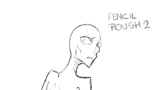
I've started work on the TVP animation for the end of the film, and I'm testing some different lining styles. The idea behind doing this in TVP rather than Toon Boom is that the Toon Boom animated segment is meant to make the creature appear quite clean and solid (what with the outline blending into the background), while the section outside the hole is meant to be less striking in terms of colours and outlines, appearing more dream-like, for lack of a better description.
The TVP style of lining is meant to be sketchier- not to the extent of having guide lines and the like show up, but definitely rougher than Toon Boom. I want the lines to have more of an energetic feel to them, although I'm still deciding between having the image redrawn every few frames to have the Rhubarb and Custard level of energy or to have it more subdued.
Below are some of the tests I made of s69-
Of these, it's the finer pencil lines that I prefer. The finer lines allow for more detail without appearing rushed. I think it's between drawing 1 (the dark, thin pencil tool) or number 5 (mechanical pencil) although I think number 1 probably works better because of the definition. The character will be stood on a light coloured background, so he still needs to be visible.
Colouring tests will be made shortly.


No comments:
Post a Comment